Industrial Data Visualization Library
Led data visualisation design for Metso Outotec, building a unified chart library across 12 solutions for engineers in mining, aggregates, oil and gas, and process industries.
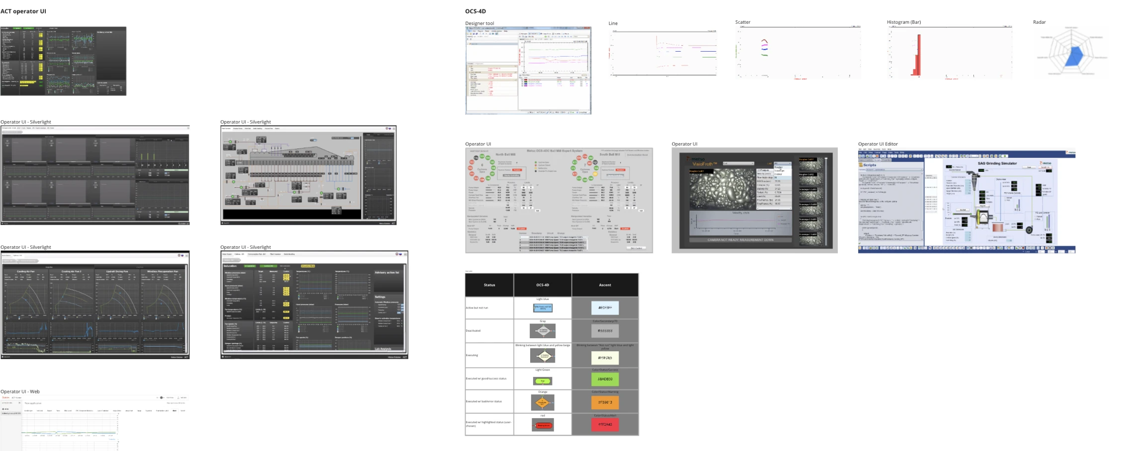
For four years I led data visualisation design at Metso Outotec, where we had twelve different software solutions all displaying data their own way. Engineers in mining, oil and gas, and recycling were navigating inconsistent charts, inconsistent colour logic, and inconsistent interaction patterns across every product they used.
I designed a unified chart library from the ground up. Eight components, all built accessibility-first because colour blindness in industrial environments isn't an edge case, it's a safety requirement. Every palette, every chart layout, every tooltip behaviour had to work across bright offices and dimly-lit control rooms in both light and dark mode.
The Problem
Metso Outotec had twelve software solutions, each with its own approach to displaying equipment performance data, production metrics, and process KPIs. The result was visual inconsistency that engineers navigated by instinct rather than pattern recognition.
The 340-person design community was making independent decisions for charts and data displays. Each product had evolved its own chart types, colour conventions, and data encoding approaches. There were no shared principles, no shared palettes, no agreed rules for when to use a gauge versus a line chart.
Before a single component could be designed, the system needed a philosophy.
My Role
Lead Designer · April 2019 – April 2023
I was responsible for the full data visualisation design programme: defining the principles, designing the colour palettes and chart layouts, establishing typography conventions for data displays, and working directly with developers to align the token language between design and implementation.
I also owned the accessibility testing, making sure every component worked for users with colour vision deficiencies, and that every decision was documented clearly enough that twelve product teams across different countries could apply it consistently.
Three Design Principles
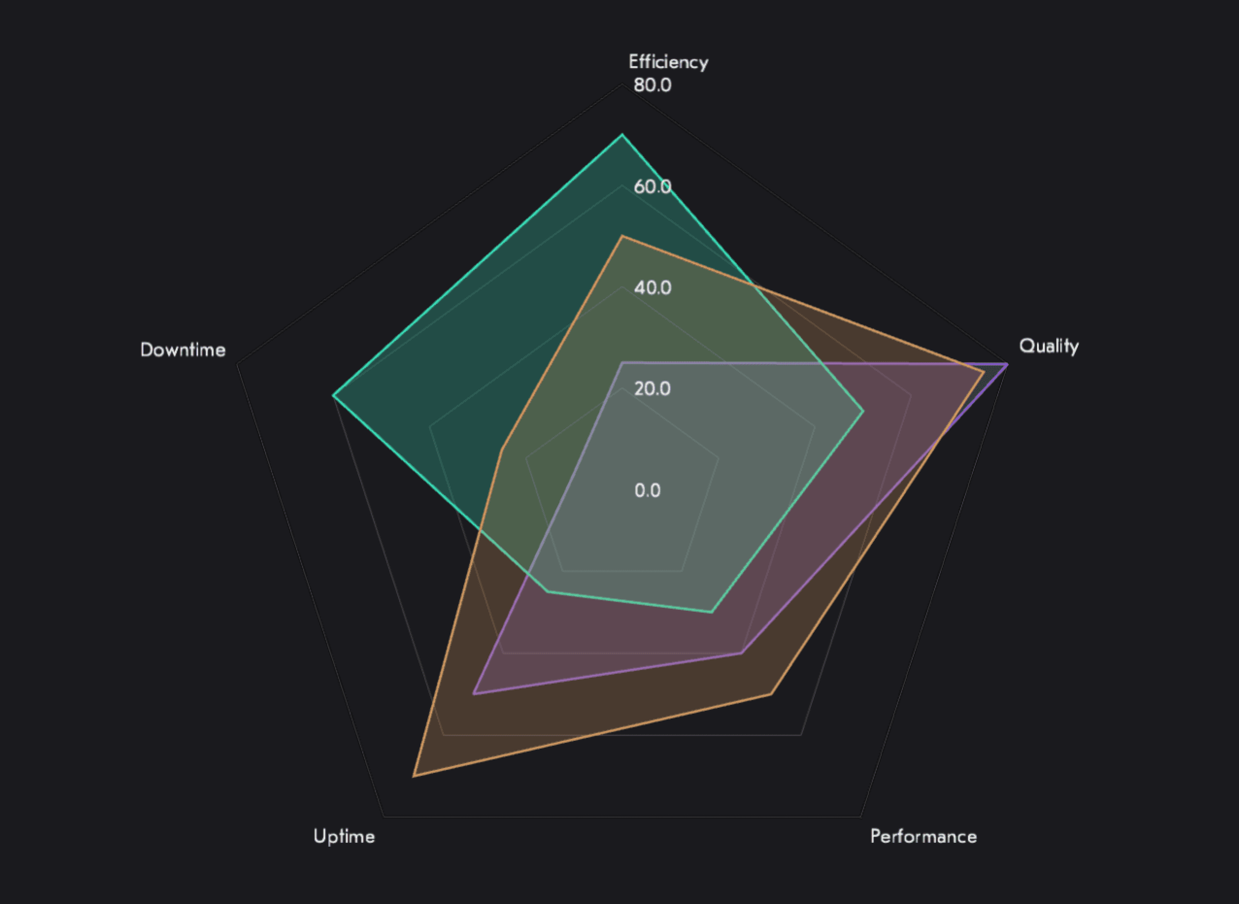
Efficiency
Communicate information efficiently by keeping visualisations intuitive, perceptible, and adaptive, accounting for the conditions of the devices and environments where they are actually used.
Accessibility
Visualise data with empathy and inclusiveness in mind. Take into account visual impairments by providing design that can be accessed easily and comprehensively by both humans and assistive technology.
Consistency
Style data in a consistent way: simplifying solutions, applying common guidelines, minimising variations, and using a defined range of library colours, fill patterns, and styled strokes.
Research & Discovery
The work began with collection before creation. We gathered the existing charts from across all twelve solutions, mapping every chart type in use, every colour approach, every data encoding decision that had been made independently across the product portfolio.
Research methods included user interviews with equipment operators, card sorting to understand how engineers mentally categorised performance data, and data analytics reviews to identify which chart interactions were actually used versus which were designed in theory.
The output was a requirements map that separated genuine user needs from design assumptions, and a shared vocabulary for talking about visualisation problems across product teams.
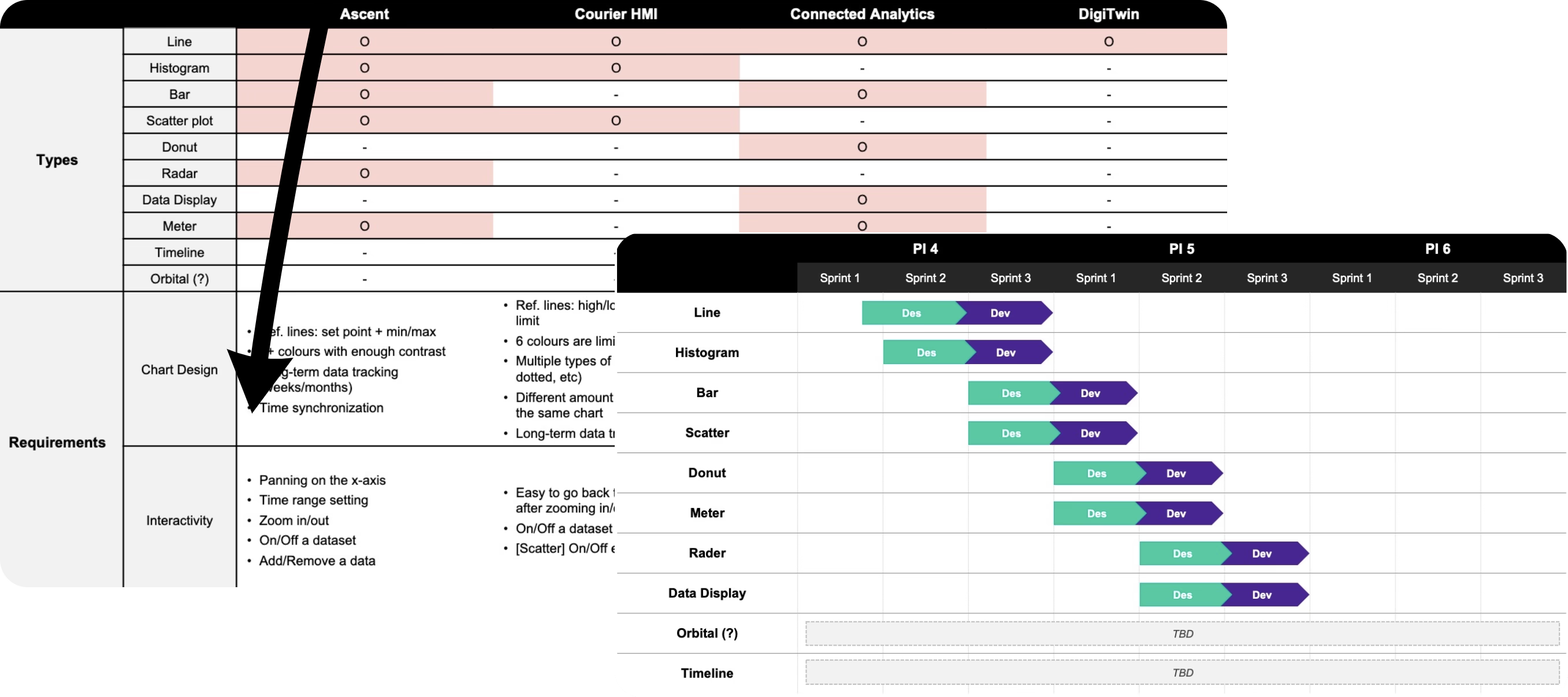
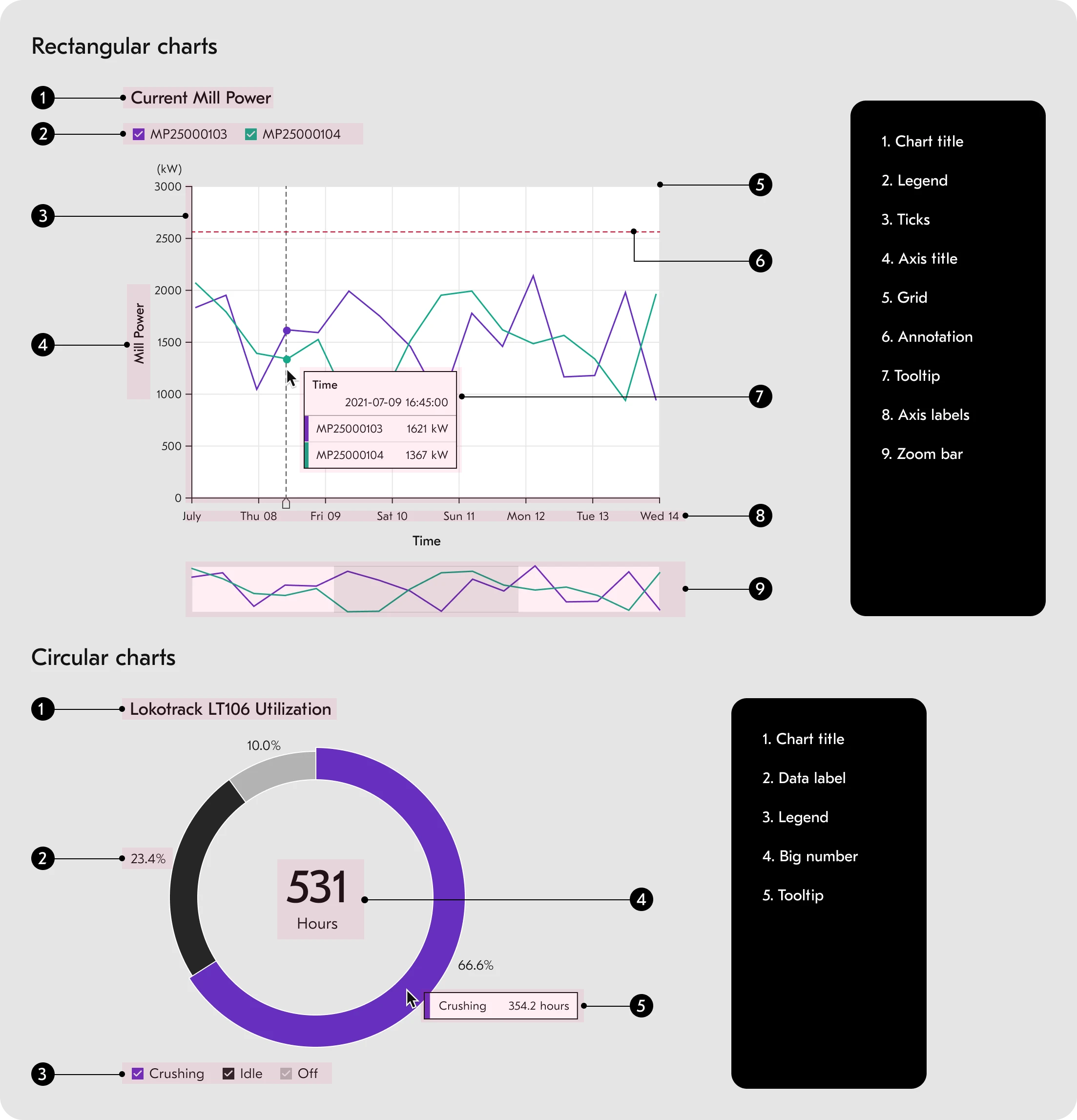
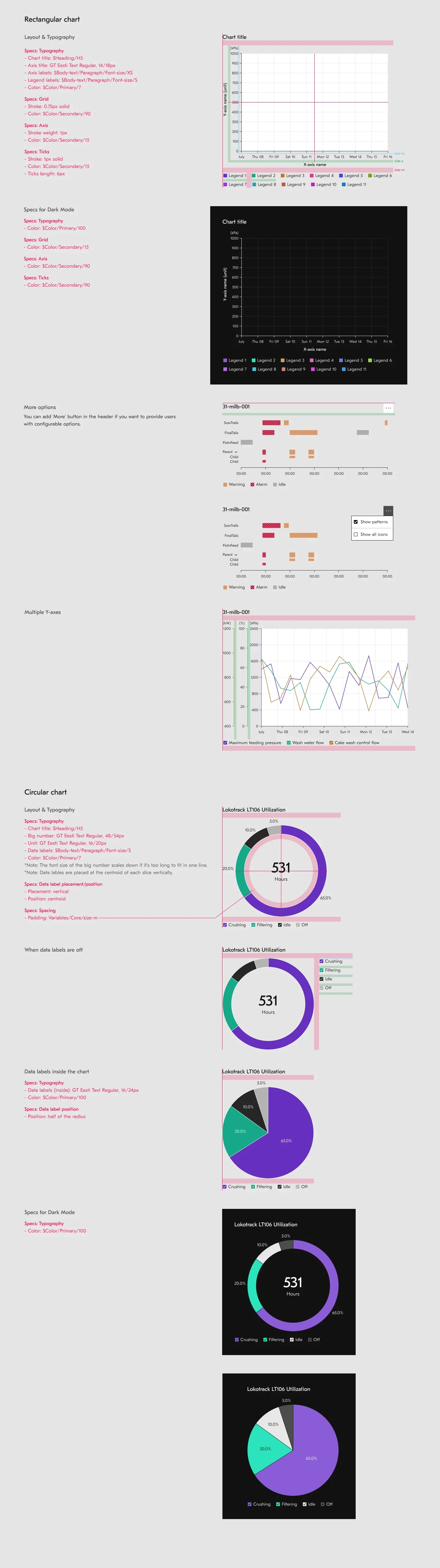
Chart Anatomy & Documentation
One of the most important outputs of this project wasn't a chart. It was documentation. Data visualisation implementations are complex, and without thorough guidelines, every team will make different decisions for every ambiguous case.
We documented chart anatomy at the component level: every element named, every spacing rule defined, every interaction state specified. The tooltip documentation alone covered single-point and multi-point hover states, overflow behaviour, truncation rules, and accessibility requirements for every chart type.
This investment in documentation was what made consistency achievable across twelve solutions built by different teams in different countries.
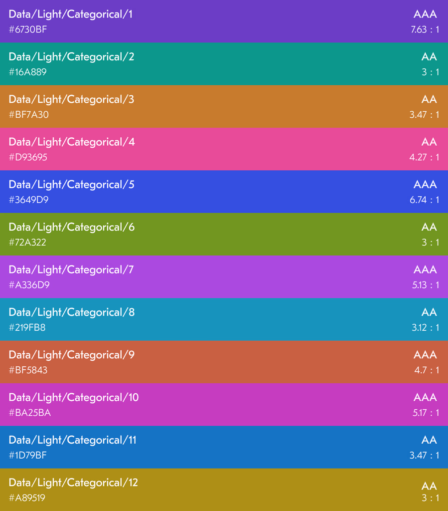
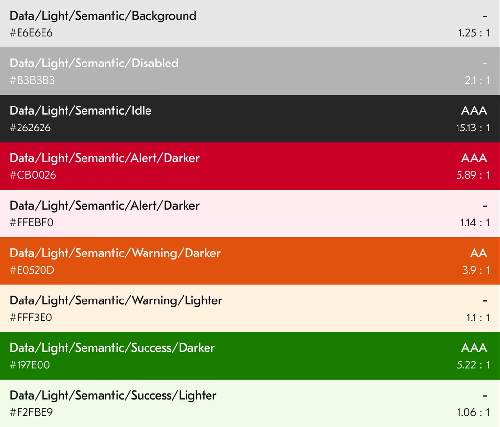
Color System
Three palettes built for industrial data.
The categorical palette distinguishes different data categories. The order of colours was deliberately chosen to maximise contrast between neighbouring values, applied in sequence so teams didn't have to make colour assignment decisions case by case.
The sequential palette illustrates correlations among data entries. It uses the 50 and 80 intensity levels of each colour before the least intense tones, maintaining legibility across both light and dark themes in industrial environments.
The semantic palette handles status communication. Disabled and Idle signal machine state; red, yellow, and green represent alerts, warnings, and success. Standardising these across all twelve solutions meant an operator could interpret status consistently regardless of which product they were looking at.
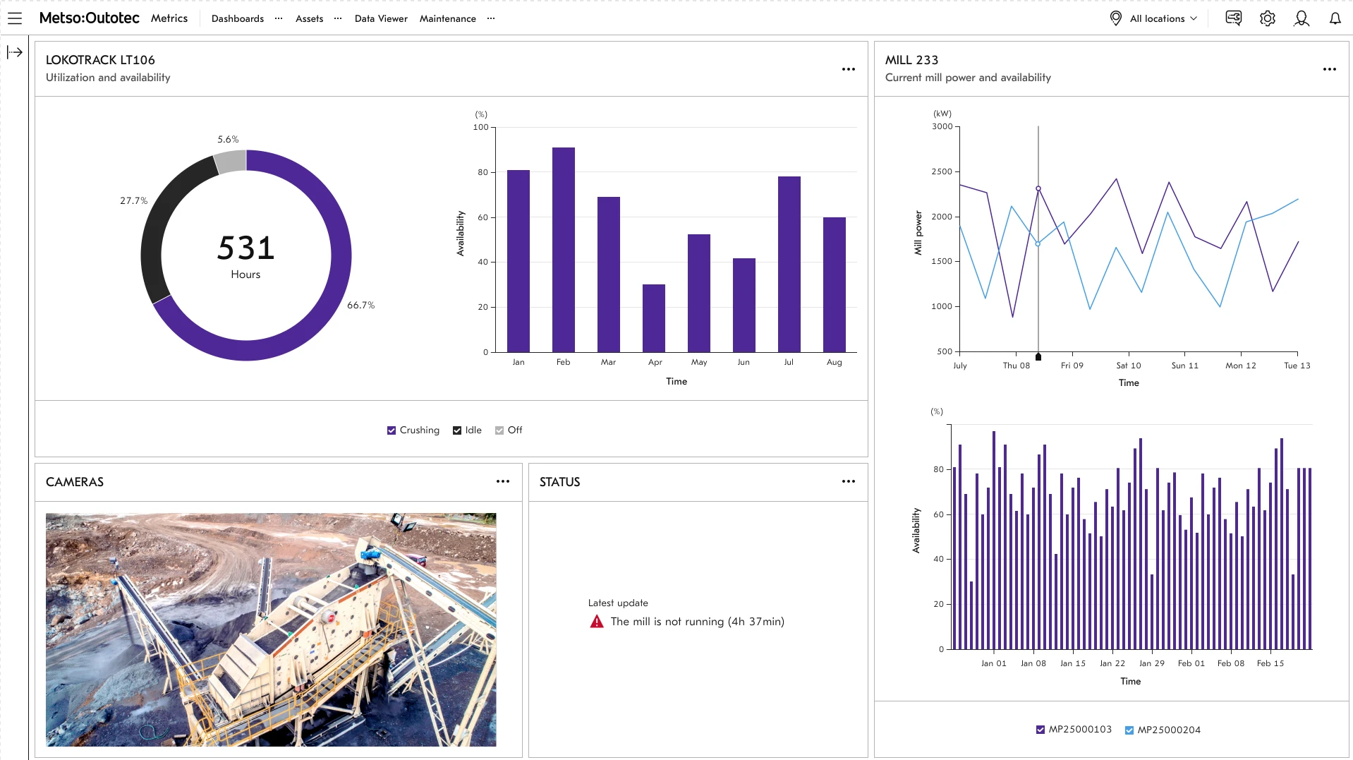
The Component Library
The library shipped eight industrial-grade visualisation components through a long release cycle, but the value was not just the count. It was the fact that the components were specified clearly enough to work across product teams, engineering contexts, and data-display scenarios without everyone inventing their own chart logic.
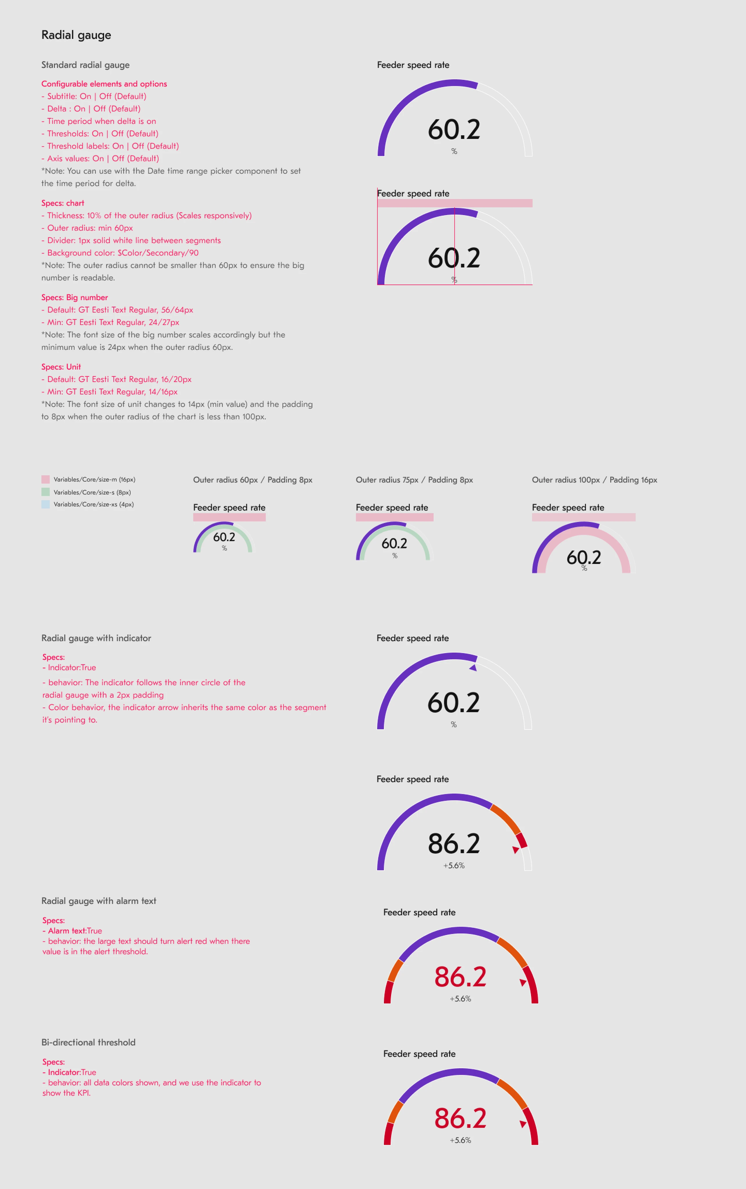
Bar, Line, Donut, Radar, and Scatter were built on Chart.js to give the system a stable implementation foundation. Speedometer, Linear Gauge, and Radial Gauge addressed more specialized industrial monitoring cases where compact threshold-driven displays mattered.
The component decisions also carried governance consequences. At v4.0, LightningChart-based work was split into its own library because the performance and licensing profile differed from standard operational dashboards. That is design-system thinking, not just chart styling.
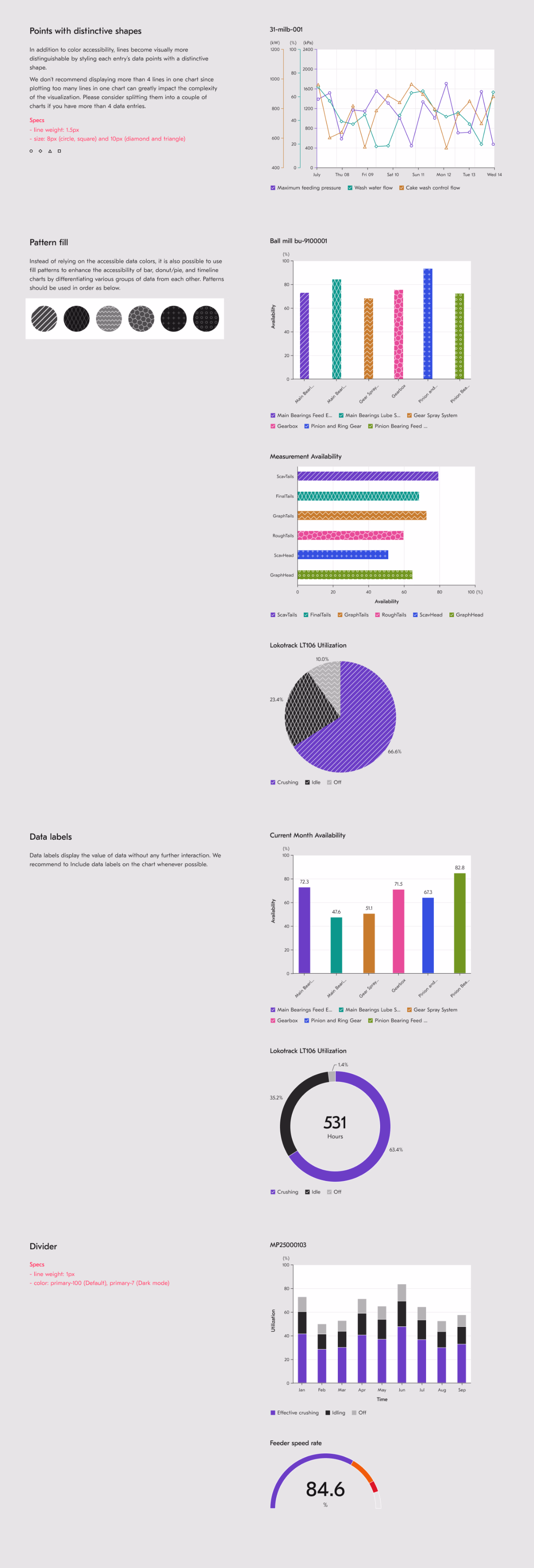
Accessibility
Industrial environments have a higher proportion of colour-deficient users than the general population. A fact that shaped every colour decision in this system.
The library addresses this through two mechanisms: WCAG-compliant palettes that maintain adequate contrast for common colour vision deficiencies, and optional pattern overlays on bar and donut charts that encode data through shape as well as colour.
The pattern approach came with a documented tradeoff: Chart.js pre-renders patterns to canvas, so enabling them reduces performance. This was an honest engineering constraint, documented for every team implementing the components rather than hidden behind an abstraction that would have let teams discover it in production.
Adoption Signal & Program Context
8 core components
Design contribution
12 solutions unified
Program context
340 design community members
Program context
22K+ downloads
Adoption signal
26+ products
Platform reach
69.9% returning users
Usage signal
When an operator reads a gauge on a mining site, they're making a decision based on what I designed. If the colour is wrong, if the scale is misleading, if the chart type obscures the pattern, they make a worse call. That's the weight of this kind of work.